

Boards and regulators now ask security teams to put cyber risk in dollars. The 5×5 heat map most programs run on cannot give them one. Here is why the color fails, and how to get to a number you can defend.
The 60-second version
Boards and audit committees have started asking a blunt question: how much money is this cyber risk worth? Since the SEC’s 2023 rules, a US public company has to disclose a material cyber incident’s impact on its “financial condition and results of operations” within four business days of judging it material. Directors now want that same view before an incident, not after it. The answer most security teams can hand them is a color.
The color comes from a 5×5 grid: likelihood on one axis, impact on the other, each rated Low to High, and the cell where they meet painted green, amber, or red. It sits on almost every risk register in the industry. It looks quantitative and it reads as rigorous. It also cannot be added up, cannot be set against the cost of a fix, and two competent assessors will color the same risk differently.
A color is not a measurement.
The 5×5 heat map turns two guesses into one label. “Likelihood: High” and “Impact: High” are ordinal words, not measured quantities, and the grid multiplies them as though they were numbers.
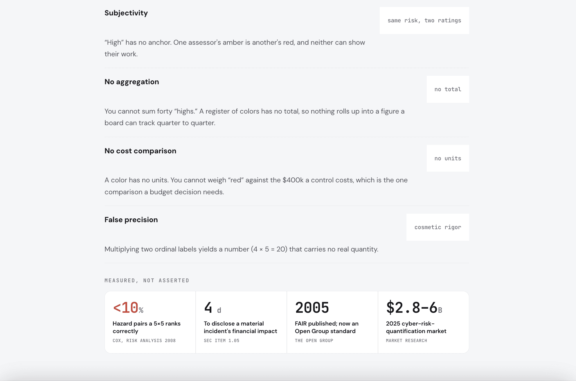
Tony Cox showed the underlying problem in 2008. A typical risk matrix, he found, can “correctly and unambiguously compare only a small fraction (e.g., less than 10%) of randomly selected pairs of hazards,” and it assigns “identical ratings to quantitatively very different risks,” an effect he named range compression. For risks whose frequency and severity pull in opposite directions, he showed matrices can be “worse than useless,” producing worse-than-random rankings.
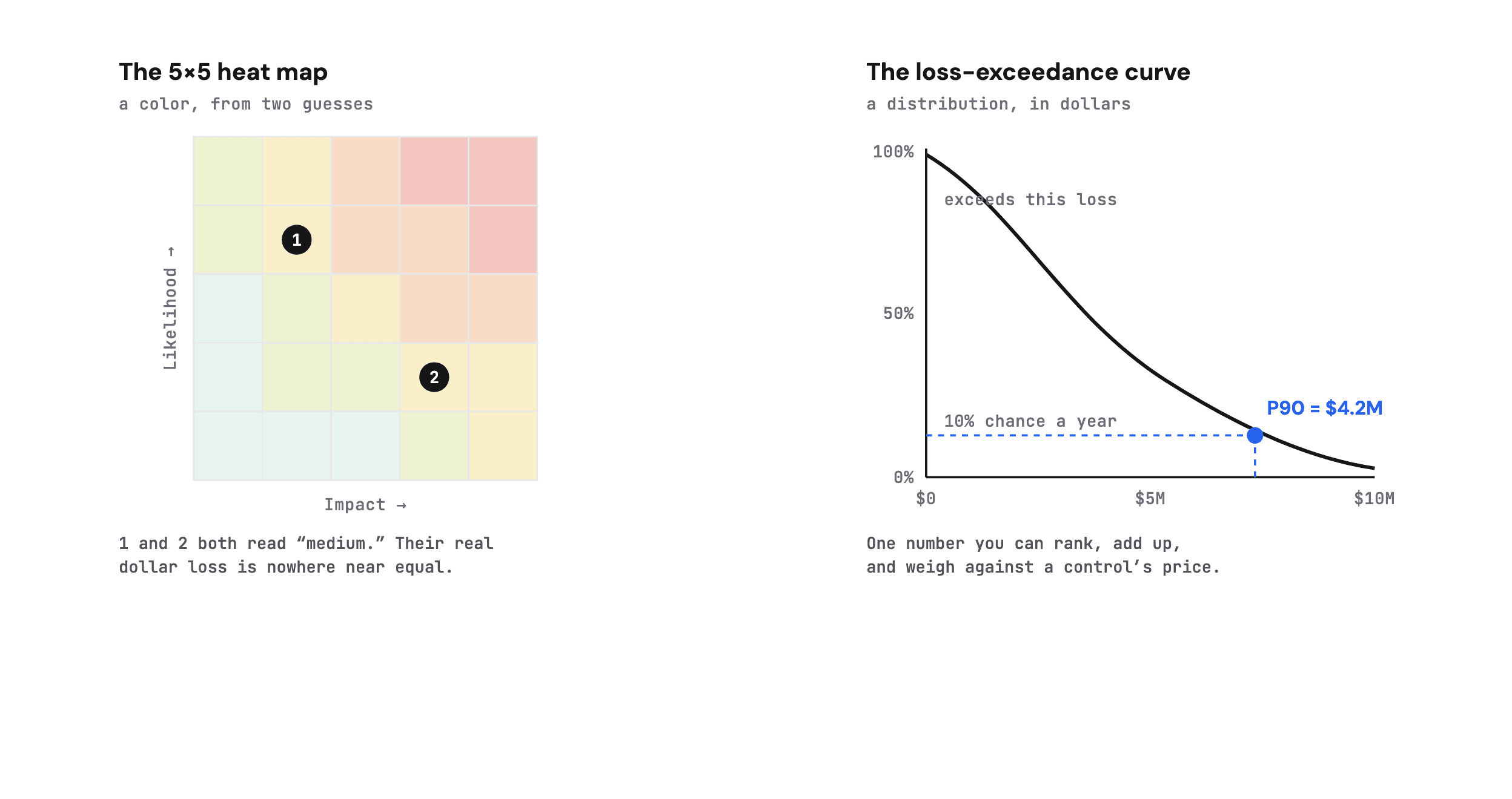
Two risks land on the same “medium” cell yet carry very different dollar loss. The curve keeps the difference and marks a P90 you can act on.
Douglas Hubbard and Richard Seiersen make the applied version of the case in How to Measure Anything in Cybersecurity Risk: ordinal scales create false precision, and in the worst case they add error instead of removing it. The grid can make a ranking worse than a coin flip while looking authoritative on a board slide.
Four failures follow from the same root.
Take the risk apart.
There is a way to answer the board’s question in dollars, and it is not new. Factor Analysis of Information Risk (FAIR) is an open, quantitative standard for information and operational risk, maintained by The Open Group as the O-RT and O-RA standards and supported by the practitioner community at the FAIR Institute.
Instead of scoring a risk on a grid, FAIR takes it apart. Risk is Loss Event Frequency times Loss Magnitude. Loss Event Frequency is Threat Event Frequency times Vulnerability, where vulnerability is the probability that an attacker’s capability exceeds the strength of your controls. Loss Magnitude is the sum of primary loss (response, replacement) and secondary loss (fines, legal, reputation).
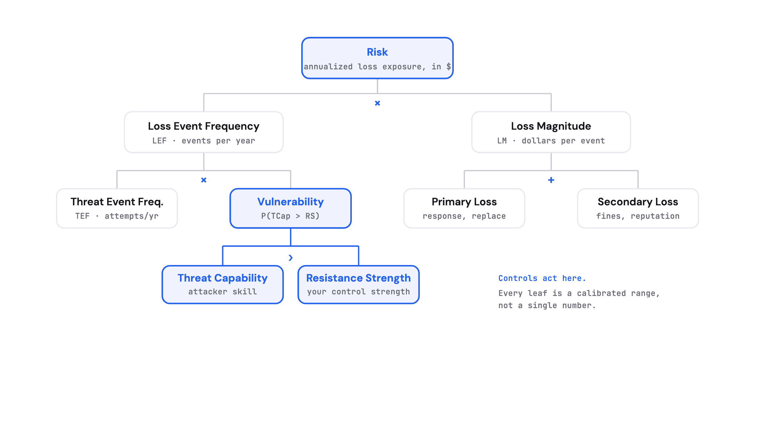
FAIR decomposes risk into estimable parts. Controls act on Vulnerability and Loss Magnitude, so their effect can be priced.
Each leaf on that tree is estimated as a calibrated range: a minimum, a most-likely, and a maximum, rather than a single guess dressed as a fact. Those ranges run through a Monte Carlo simulation, thousands of iterations, to produce a distribution of annualized loss exposure. The output is a loss-exceedance curve that says, for example, there is a 90% chance the yearly loss stays under $4.2M. That P90 is a number you can rank against other risks, add into a portfolio, and set against the price of a control.
The honest tradeoff
FAIR asks for more work than coloring a cell. It needs calibrated estimates, and calibration takes training and discipline, which is why quantification stayed with specialist teams for years. It does not predict the future. What it does is narrow the uncertainty around a decision and state the uncertainty that remains, in dollars, so two people can argue about the inputs instead of the color.
Get the number, then use it.
Two tracks. One builds the dollar figure; the other spends against it. Neither works without the other.
AQuantify the risk
For a risk you already track
1Frame one loss scenario
Name the asset, the threat, and the effect in a single sentence (“ransomware halts order processing for N days”). A vague risk cannot be measured; a specific scenario can.
Closes subjectivity
2Estimate the factors as ranges
Give threat event frequency, vulnerability, and loss a calibrated min / most-likely / max, and record who estimated and why. A range you can defend beats a point you cannot.
Closes false precision
3Run the simulation
Push the ranges through Monte Carlo to get a distribution, not one number. The spread is information, so keep it.
Closes false precision
4Read the exceedance curve
Report the shape and a percentile (P90), not just an average. The tail is where the board’s real question lives.
Closes no aggregation
BUse the number
Once the risk has a dollar figure
1Rank by loss exposure
Sort the register by P90 dollars, not by color. The top of that list is where attention and budget go.
Closes no cost comparison
2Compare each risk to its fix
Put a control’s cost next to the loss exposure it removes. A treatment that costs more than it buys is now visible.
Closes no cost comparison
3Aggregate to a portfolio
Because the risks share a unit, they add. One number for the whole register, tracked over time.
Closes no aggregation
4Report the P90 to the board
Hand directors an annualized loss exposure with its uncertainty, in the language a disclosure will use anyway.
Closes subjectivity
The heat map was cheap to draw. The bill comes due when someone asks what the color is worth.
A defensible number takes more work, and for a long time that work needed a team of specialists. Zania brings FAIR-based first-party risk quantification within reach: its agents draft the loss scenarios and the frequency, vulnerability, and loss ranges, justify each estimate from your own evidence, and run the Monte Carlo, so a small team gets a dollar figure, a portfolio view, and the control ROI to back a budget.
See how Zania quantifies first-party risk with FAIR →
Sources
01Cox, “What’s Wrong with Risk Matrices?”, Risk Analysis (2008)
02Cox (2008), abstract, PubMed 18419665
03Hubbard & Seiersen, How to Measure Anything in Cybersecurity Risk
04SEC, Cybersecurity Risk Management, Strategy, Governance, and Incident Disclosure (2023), Item 1.05
05The Open Group, Open FAIR (O-RT Risk Taxonomy, O-RA Risk Analysis)
06FAIR Institute, What is FAIR
07Factor Analysis of Information Risk (FAIR) Standard v3.0 (January 2025)
08Cyber Risk Quantification market size and forecast, Business Research Insights (2025)
Share

© 2026 Zania Inc.
1950 University Ave Palo Alto, CA 94303